DBHDS Site Redesign
Role:
UX Researcher, UX/UI Designer (Individual)
Time:
4 weeks, Spring 2023
Overview:
This project was completed as part of Columbia University's UX/UI Design Bootcamp, with the goal of redesigning a government website to significantly improve its user interface, usability, and overall user experience.
The Virginia Department of Behavioral Health and Developmental Sciences is a state agency that provides services related to mental health, intellectual disabilities, and substance abuse within the Commonwealth of Virginia.
Context
The Virginia Department of Behavioral Health and Developmental Services website poses major usability challenges, with key information buried under a complex and unintuitive interface. This not only frustrates users and wastes valuable time but also creates barriers for individuals urgently seeking critical resources and support.
To address these issues, I restructured the site map and introduced clean, accessible visual design enhancements—streamlining user flows and creating a more modern, responsive experience that prioritizes clarity, efficiency, and ease of access.
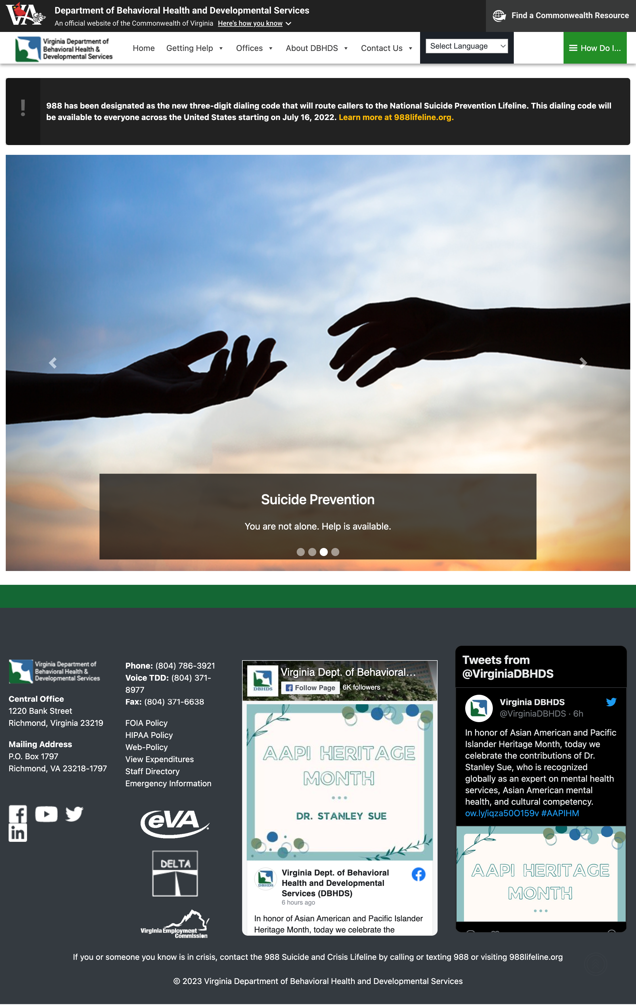
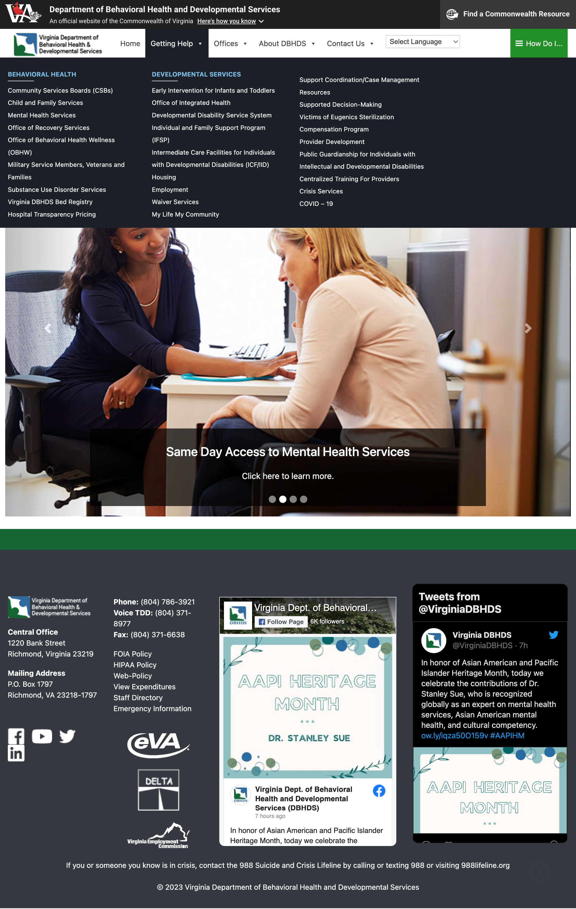
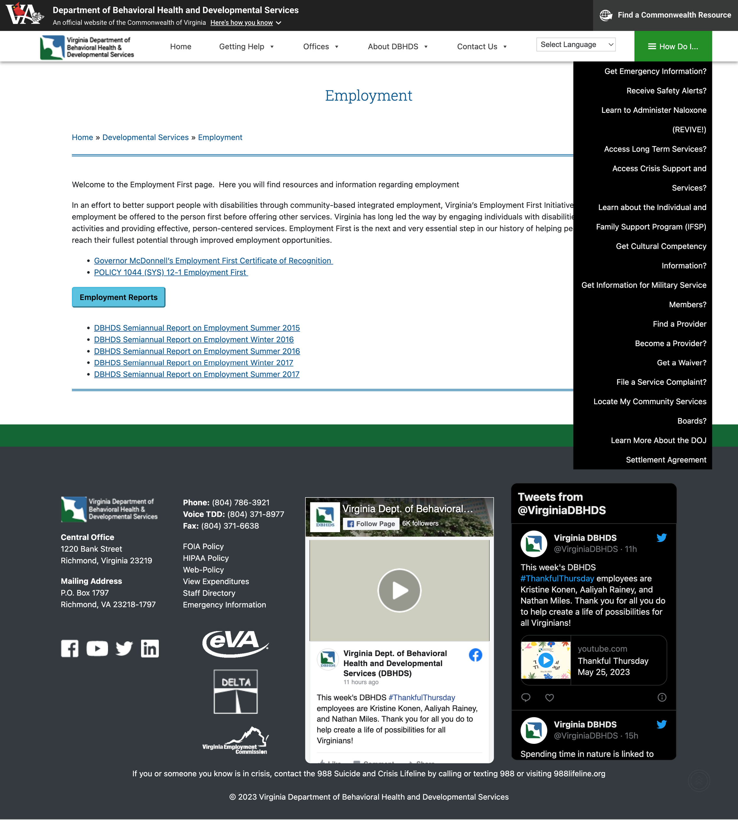
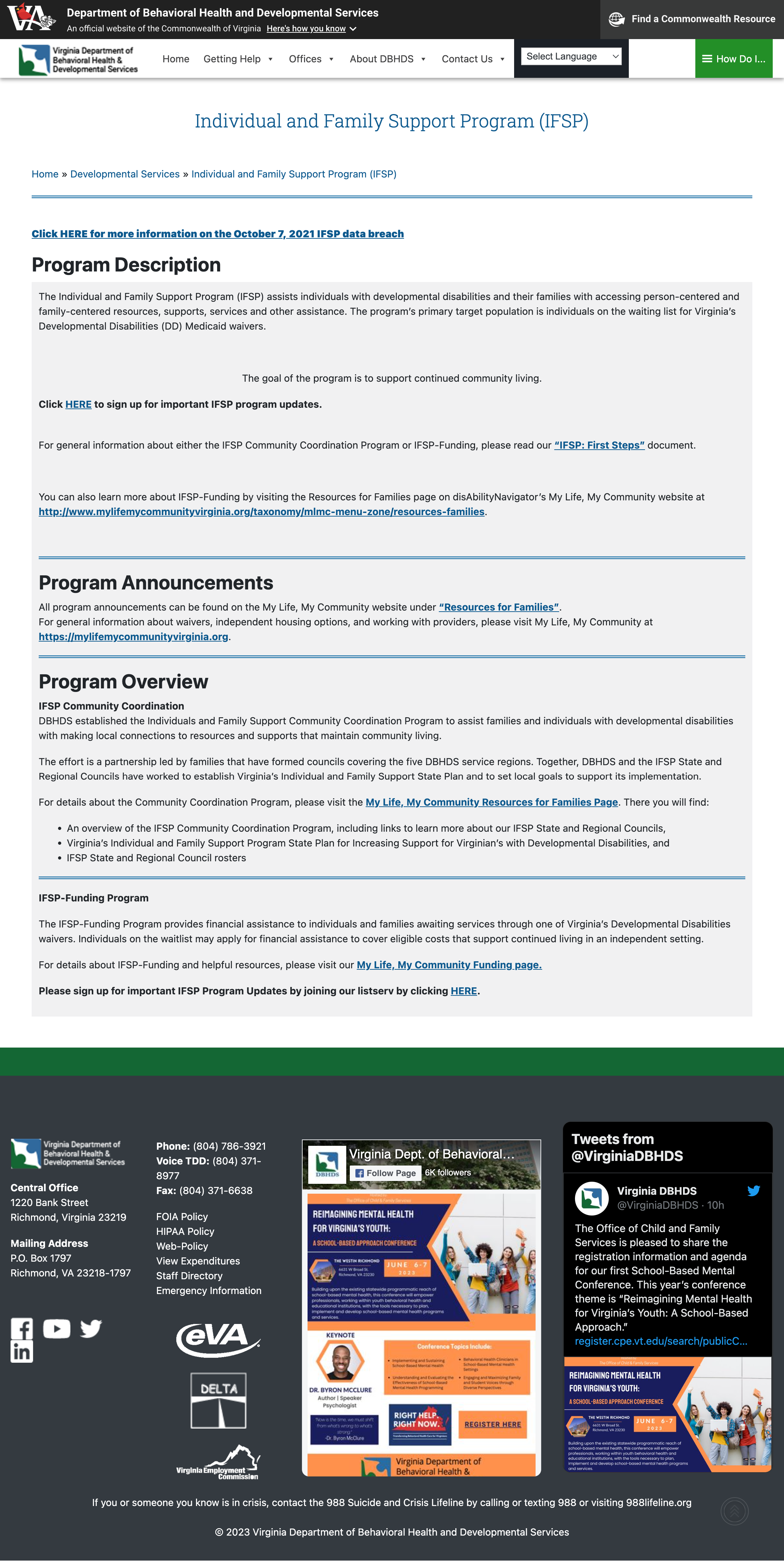
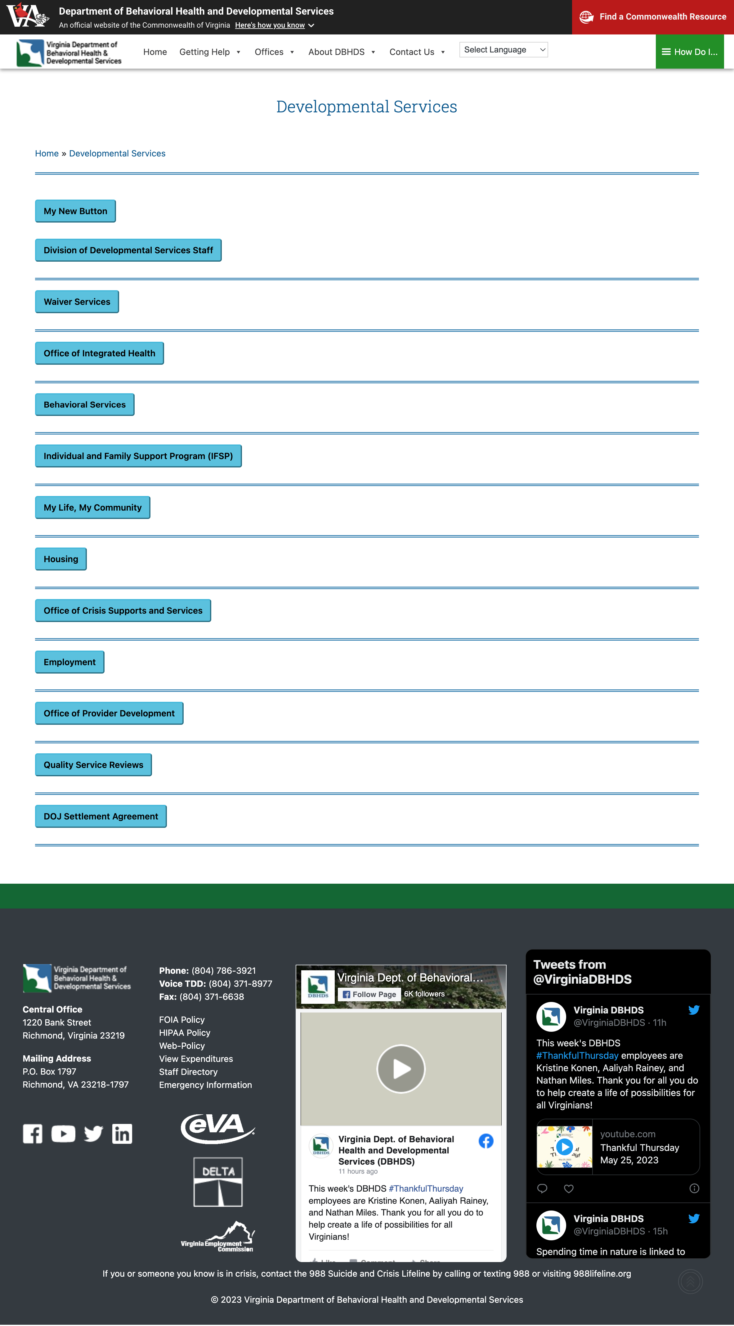
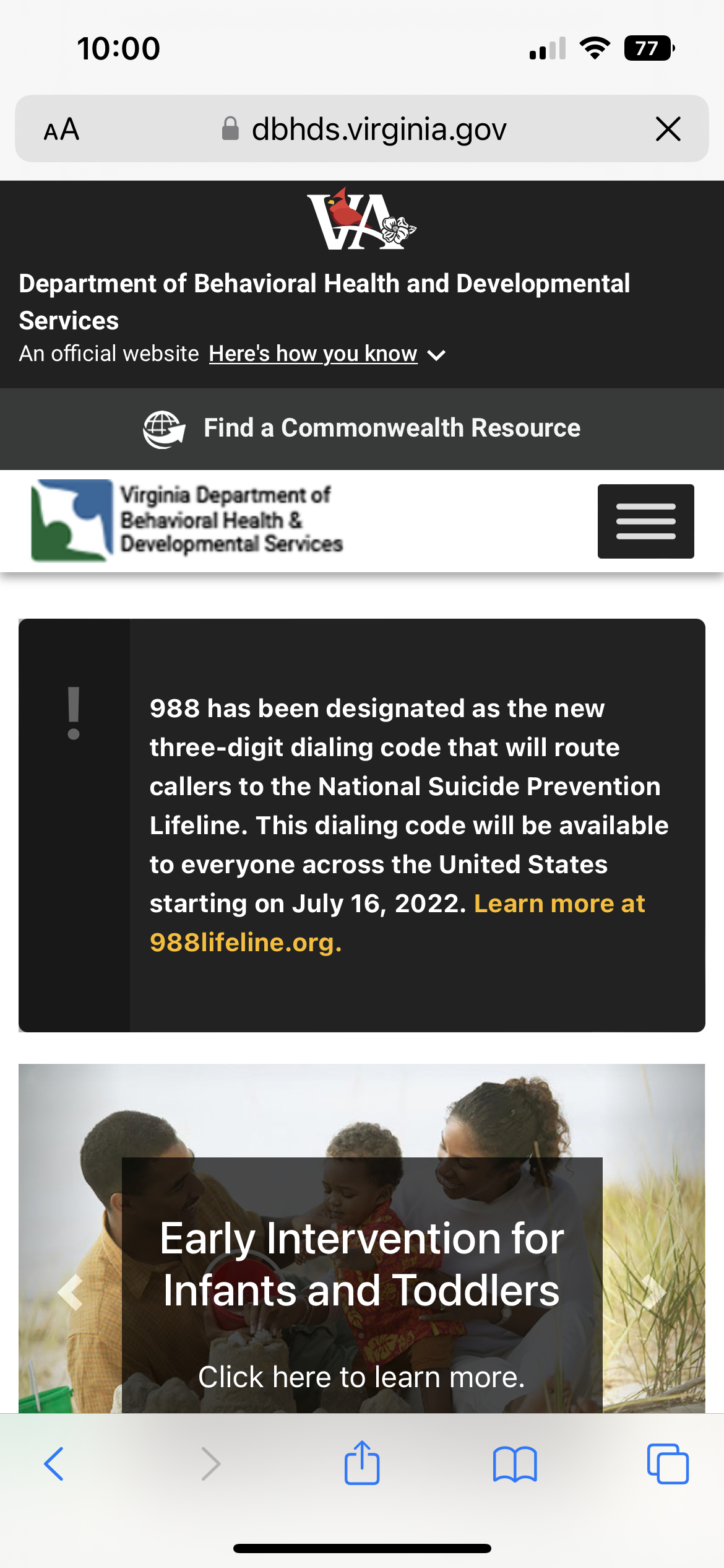
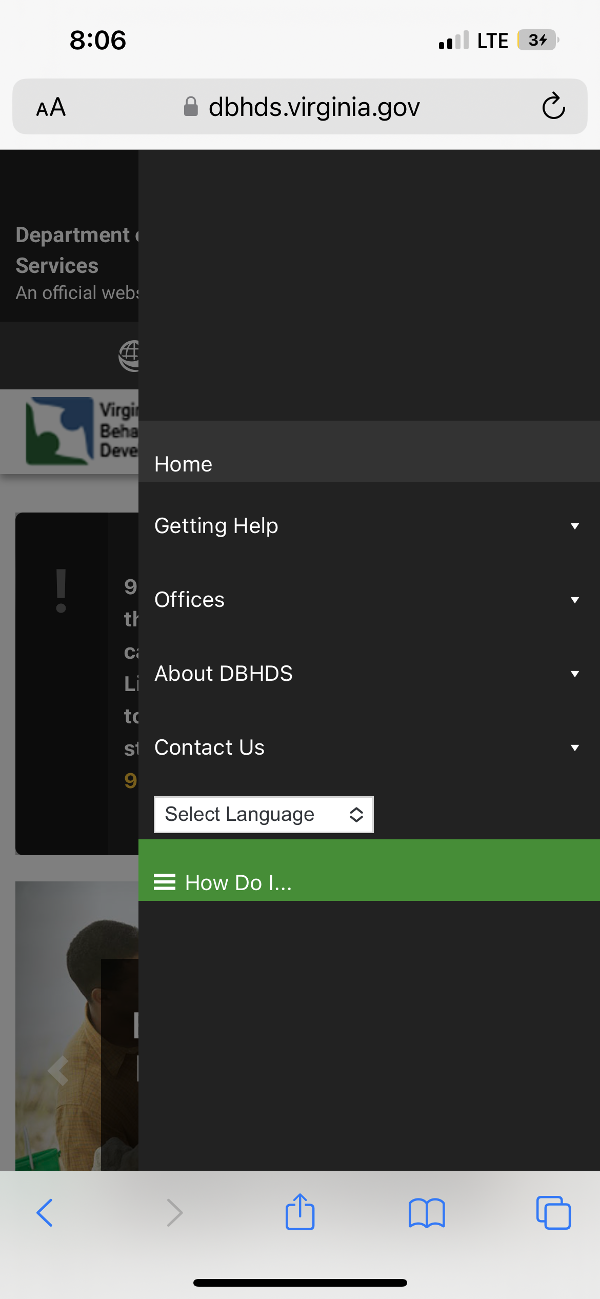
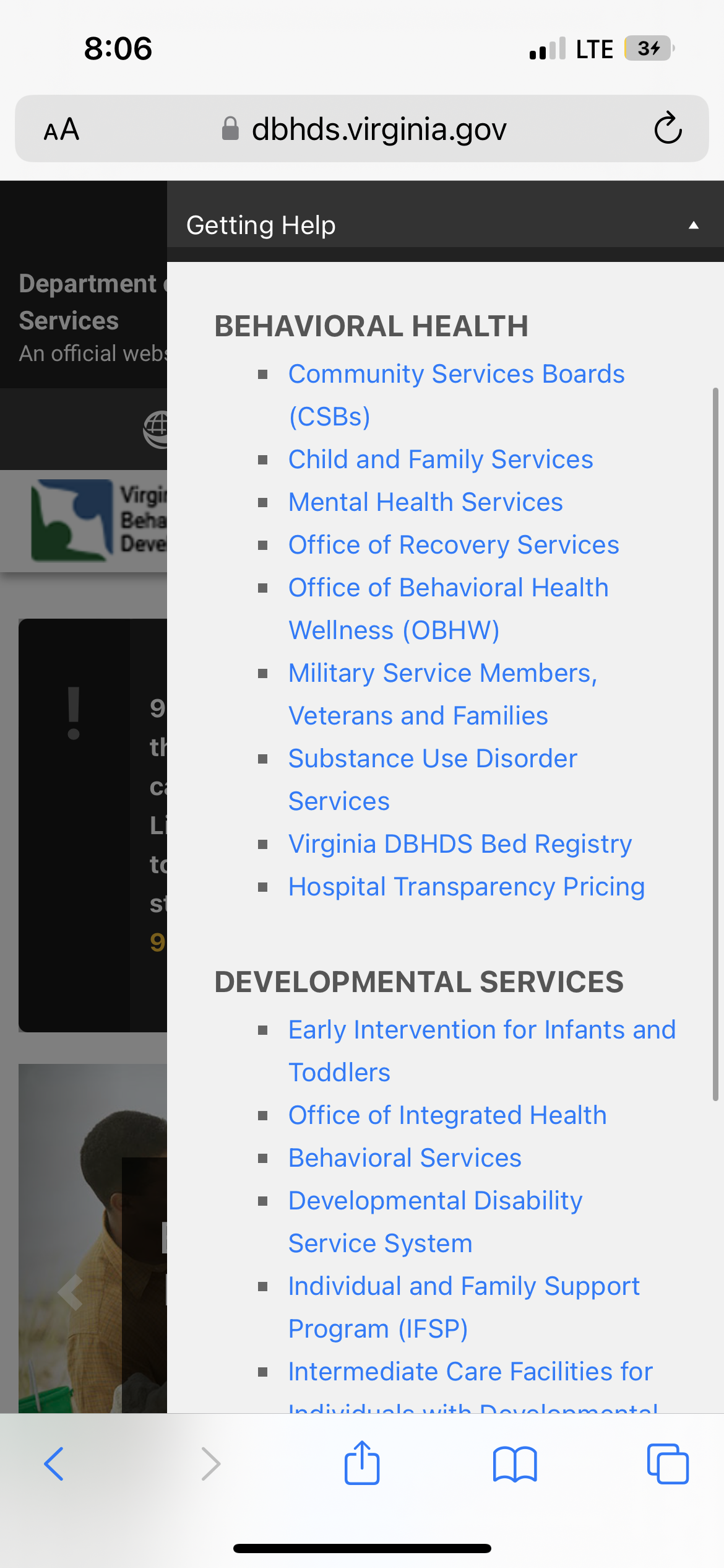
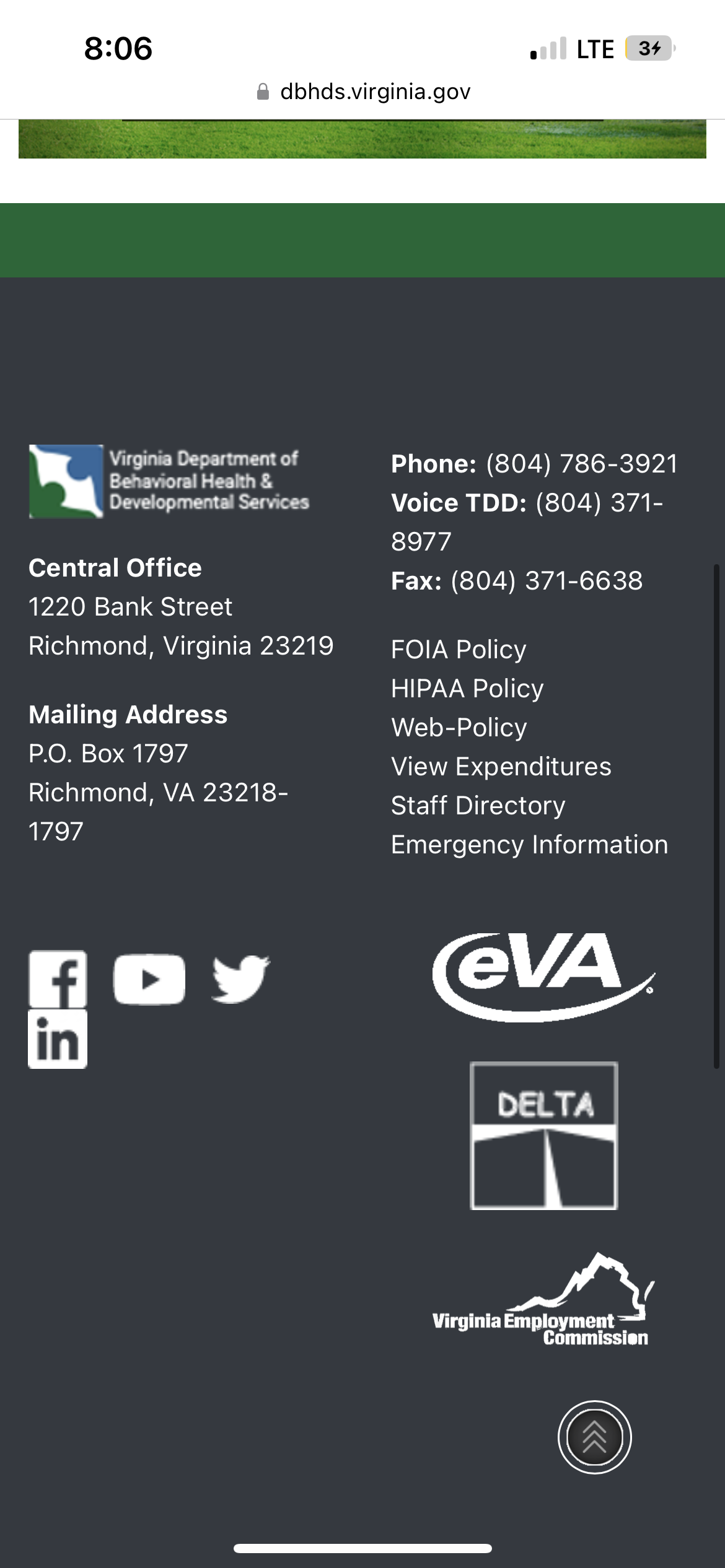
Existing User Interface
Understanding the problem
To gain deeper insight into the user pain points on the Virginia Department of Behavioral Health and Developmental Services website, I conducted remote usability testing via Zoom on both the web and mobile versions. Participants were asked to complete three key tasks designed to evaluate the site’s core functionality:
Task 1: Locate Crisis Services
Task 2: Call the department
Task 3: Find FOIA request page
Results:
The results revealed major usability shortcomings. The web version earned a System Usability Scale (SUS) score of 55.8, placing it in the “Poor” category—highlighting the need for significant design improvements to support user needs more effectively.
What’s Working Well
Breadcrumb trails clearly indicate the user’s path from the homepage to their current location, helping users stay oriented and understand the site hierarchy.
A consistent and accessible method for returning to the homepage ensures smoother navigation and reduces user friction.
Opportunities for Improvement
The overall layout feels cluttered and lacks intuitive flow, making it difficult for users to scan and engage with the content.
Visual inconsistency across buttons, links, and typography creates a disjointed experience and undermines the site’s credibility.
Dense blocks of text overwhelm users. Content should be broken into digestible chunks with clear headings for improved readability.
The frequent use of technical jargon makes key information inaccessible to a general audience. Plain language would improve comprehension.
Important content is buried or poorly emphasized—it needs to be surfaced more strategically to guide users effectively.
The absence of a search function significantly hinders users’ ability to locate specific information quickly.
Users are faced with an information overload upon arrival, which can feel disorienting and reduce engagement.
Restructuring the Information Architecture
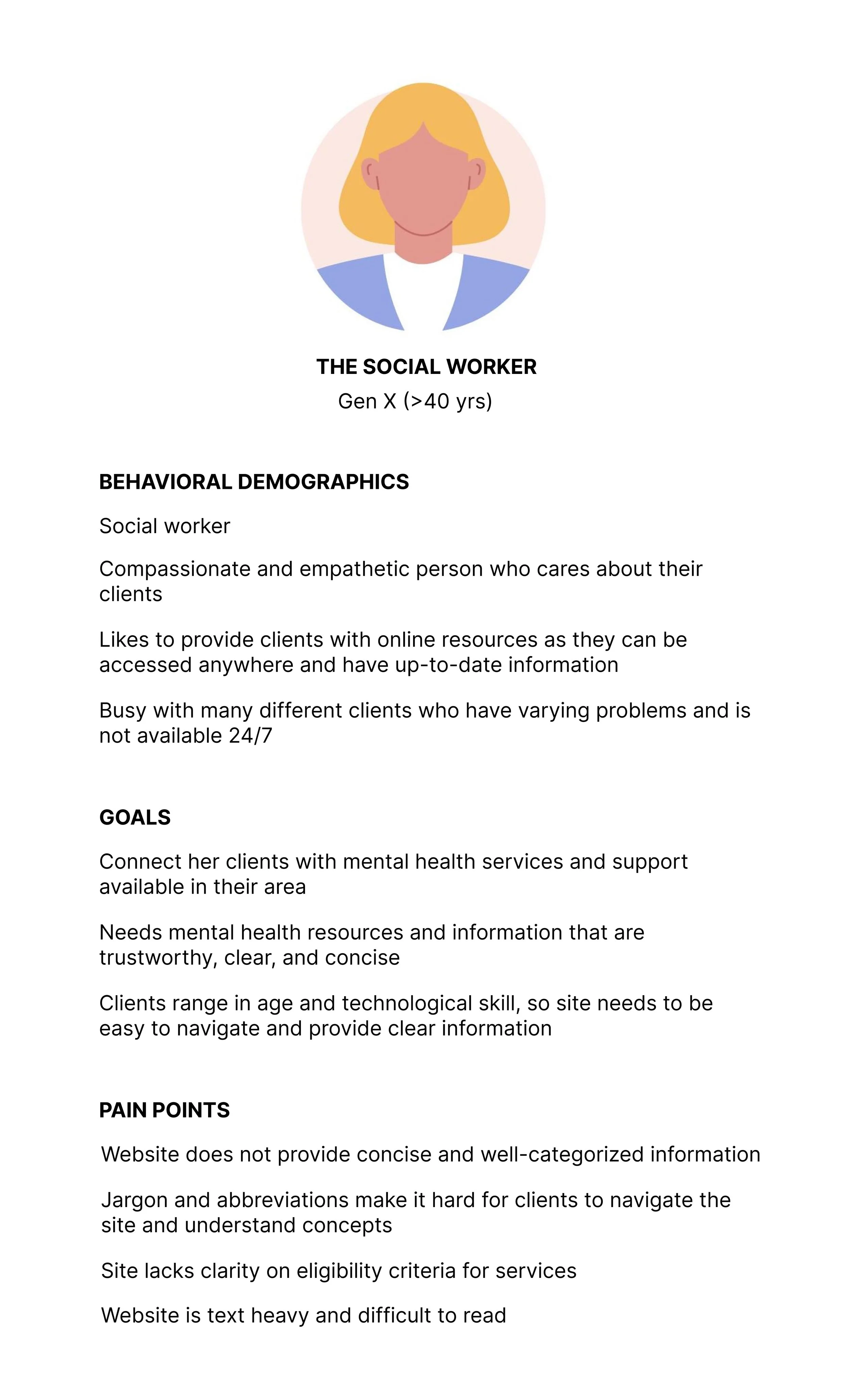
To lay the foundation for a more intuitive and user-friendly site, I began by creating a user persona—Lynn, a social worker navigating the site on behalf of her clients. Designing with Lynn in mind allowed me to make human-centered decisions that prioritize clarity, accessibility, and real-world usability.
User Scenario
Lynn is a dedicated social worker helping a client whose family member has developmental disabilities. She’s searching for local government aid options, including waiver programs, housing assistance, vetted service providers, and access to community support networks. While Lynn is familiar with industry jargon and acronyms, her client may not be—making it essential that the site serves both professional users and individuals with no prior experience in this field.
User Path
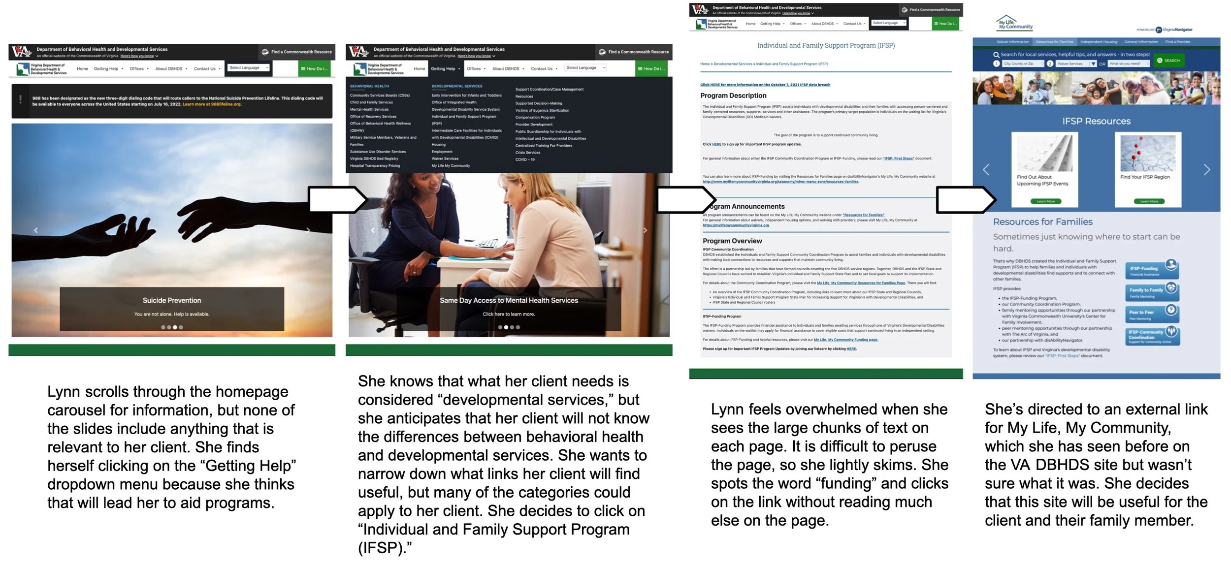
Identified Issues
The original site overwhelms users by presenting too many subpages at once, with little clear organization or hierarchy. This leads to confusion, cognitive overload, and inefficient navigation.
My Approach
To improve the site’s information architecture, I developed an entirely new sitemap focused on clarity and logical flow. I used card sorting techniques to group related subpages into intuitive categories, creating a structure that makes it easier for users like Lynn—and those she supports—to quickly locate essential information.

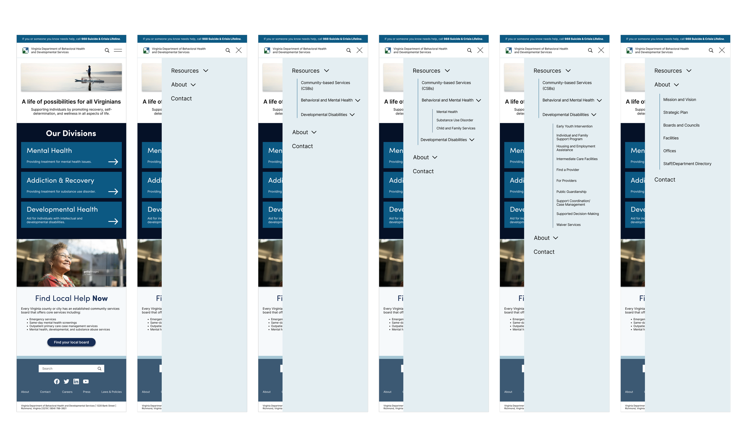
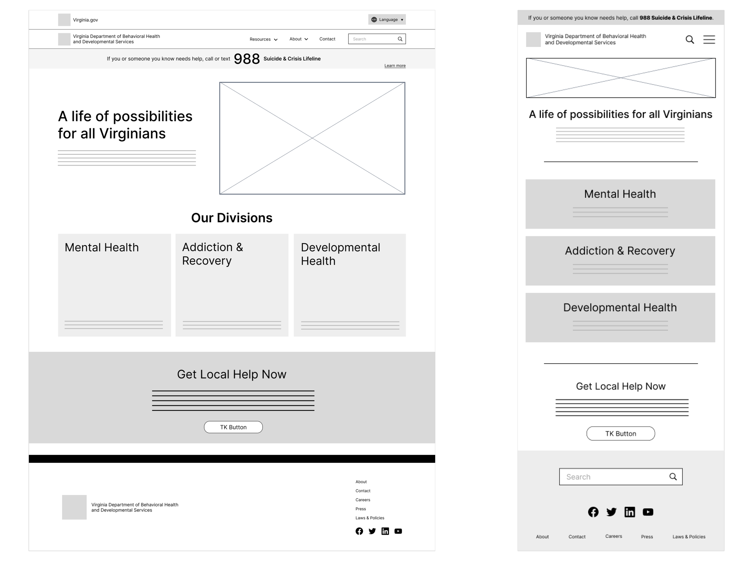
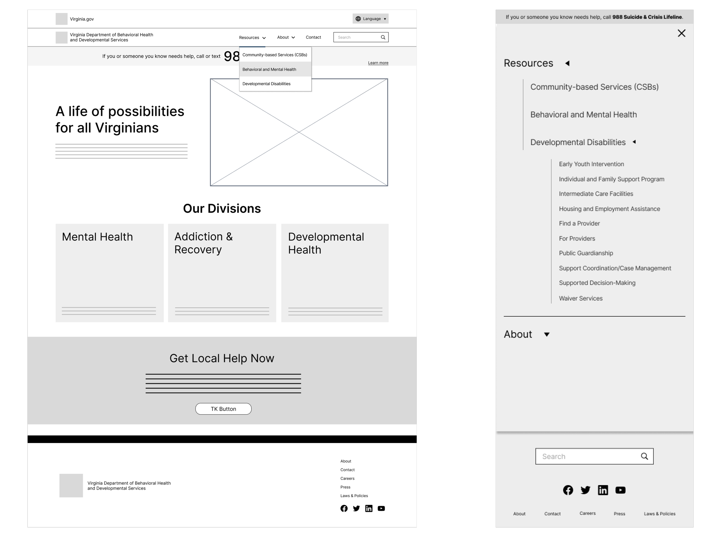
Low-Fidelity Prototypes
Before diving into visual design, I created low-fidelity wireframes to map out the core structure, layout, and functionality of key pages. These wireframes allowed me to focus on content hierarchy, user flows, and navigation without being distracted by aesthetics. They also served as an early-stage tool for validating layout decisions and testing user interactions before moving into more refined visuals
Visual Language &
Style Exploration
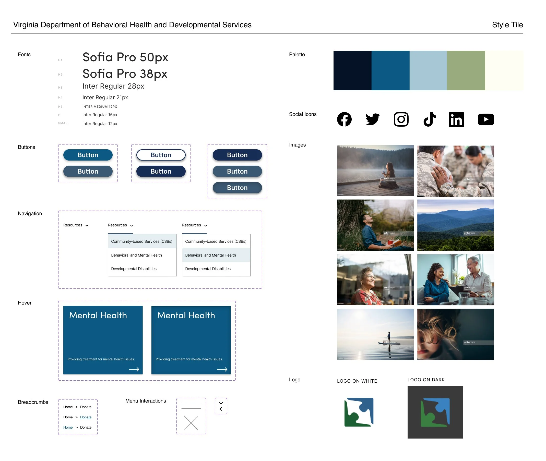
For this brand, the emotional experience of the website is just as vital as its usability. To ensure the interface conveyed the right tone, I first created a mood board to define the visual direction, then developed a style tile to translate that mood into concrete UI elements.
Through research of professional mental health websites, I identified a common design thread: a focus on calm, clarity, and restoration. These sites consistently used clean, minimal layouts, soft imagery, and approachable sans serif typefaces to evoke trust and tranquility.
Every element in my style tile was chosen with intention. For example, I selected a palette centered around green and blue hues, which are scientifically linked to feelings of calm and reassurance due to their association with nature.
Once satisfied with the visual direction, I applied the style tile elements to my interactive prototype, ensuring the interface not only looked polished but also supported a serene and intuitive user experience.
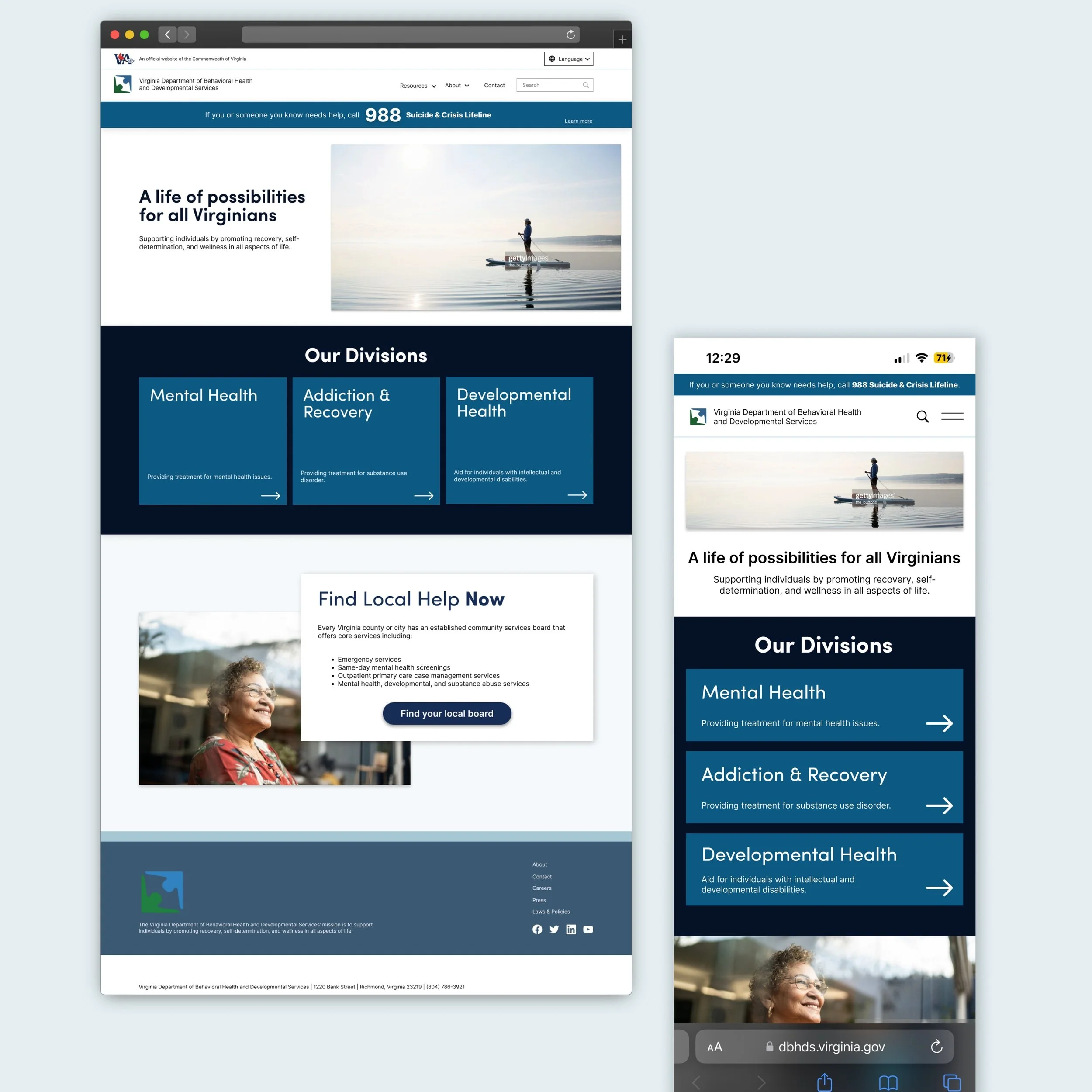
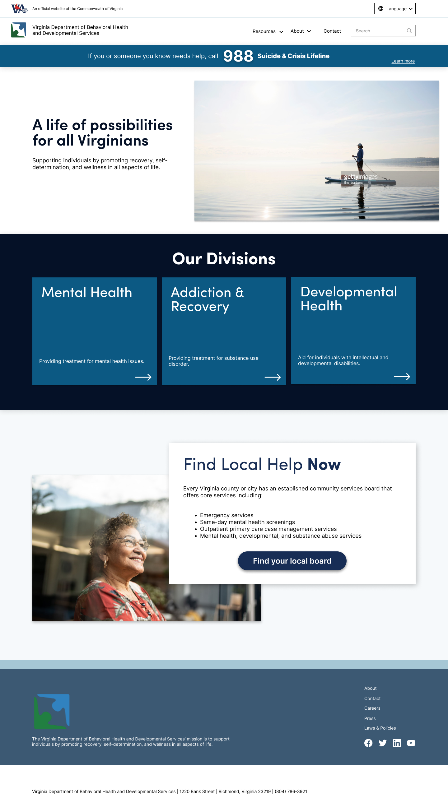
High-Fidelity Prototype
Once the structure was finalized, I translated the wireframes into high-fidelity prototypes, applying the visual language established in my style tile. These polished screens incorporate real content, brand colors, typography, and imagery—bringing the redesigned interface to life. The high-fidelity prototype reflects a fully responsive and accessible design that is both user-friendly and emotionally resonant, aligning with the needs of both professionals and the communities they serve.
Web Prototype
Mobile Prototype