Reformation UX Redesign

Role:
UX Researcher, UX Designer (Individual)
Independent project, not affiliated with or endorsed by Reformation.
Time:
4 weeks, Winter 2024
Overview:
Reformation is a high-end clothing brand known for its technology-driven retail concept, offering a seamless blend of fashion and innovation.
This redesign project, unaffiliated with the brand, focuses on improving the user experience of Reformation's digital shopping interface, aiming to elevate both functionality and customer satisfaction.
Context
During my time as a sales supervisor at Reformation’s flagship in New York City—a tech-enabled concept store—I gained firsthand insight into the smart showroom model, identifying both its strengths and areas for improvement.
The Traditional Shopping Experience
In a typical retail store, shoppers browse racks, find their size, select a few items, and bring them to the dressing room. If needed, they can ask a sales associate for a different size before heading to the checkout.
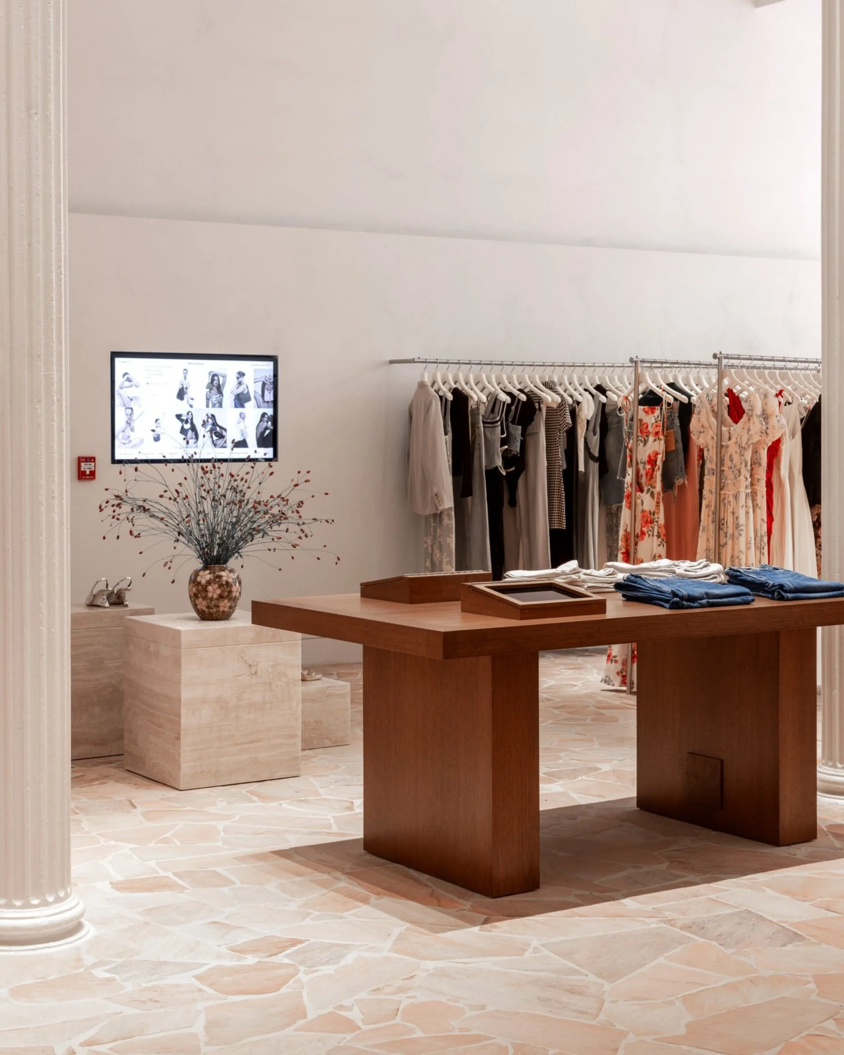
Reformation's Smart Showroom Model
Reformation takes a different approach. Upon entering the store, shoppers are greeted by a sales associate who introduces them to the brand’s tech-enabled showroom model. Rather than stocking full-size runs on the sales floor, only one of each item is displayed. Shoppers don’t take clothing directly to the fitting room—even if it's in their size. Instead, they request items, and associates retrieve the correct size from the back stockroom.
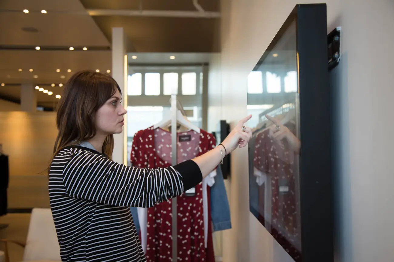
Requests can be made either by speaking with a sales associate or by using interactive wall-mounted touchscreens—designed to mimic the ease of online shopping. Either way, nearly every shopper engages with the digital interface during their visit.
While this tech-enabled showroom model is effective on a smaller scale, Reformation’s flagship location in New York City presents unique challenges. High foot traffic—especially on weekends—puts pressure on store operations, making it difficult for associates to explain the model to every visitor.
During my time at Reformation, I observed recurring frustrations from both customers and staff. The combination of a dense shopping environment and a somewhat complex store concept often led to confusion, delays, and miscommunication.
Many of these issues could be alleviated through targeted UX improvements—streamlining the shopping experience, minimizing friction, and enhancing both efficiency and satisfaction for shoppers and employees alike.
Read more about the unique store experience here.
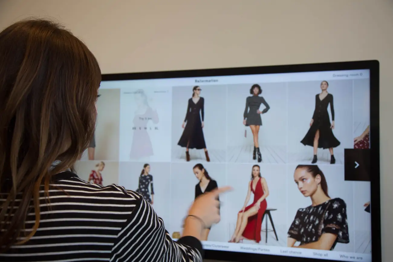
Existing User Interface

Common Pain Points
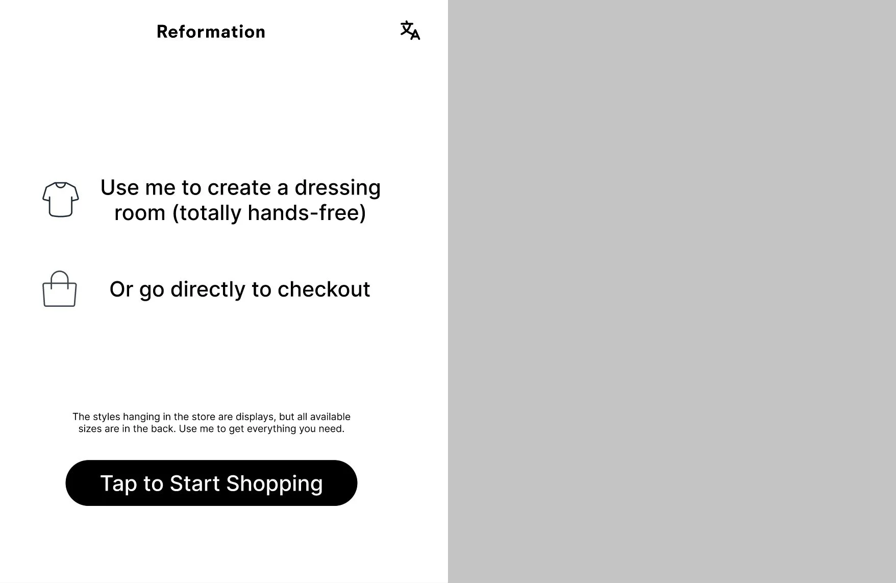
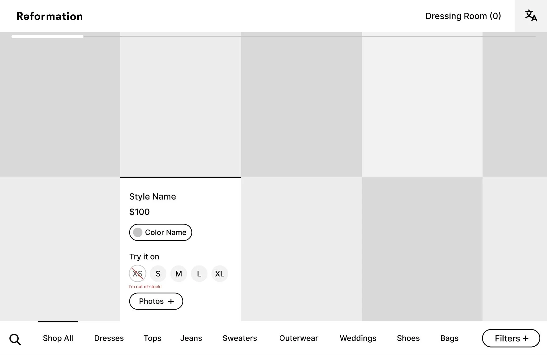
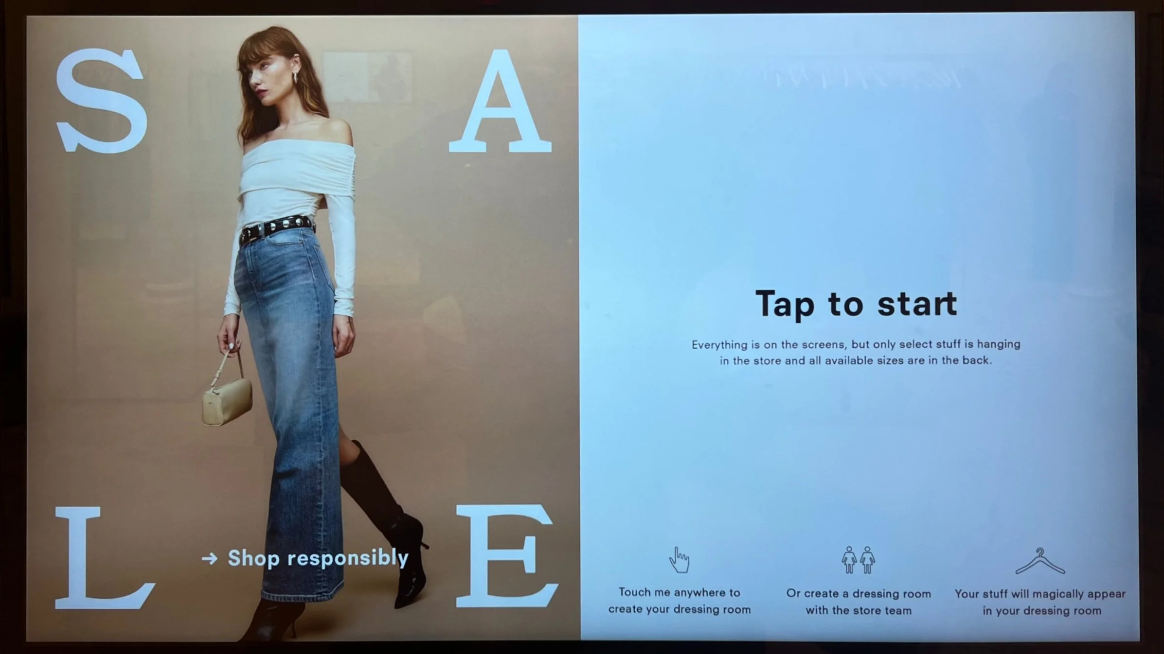
Unclear Wall Screen Purpose:
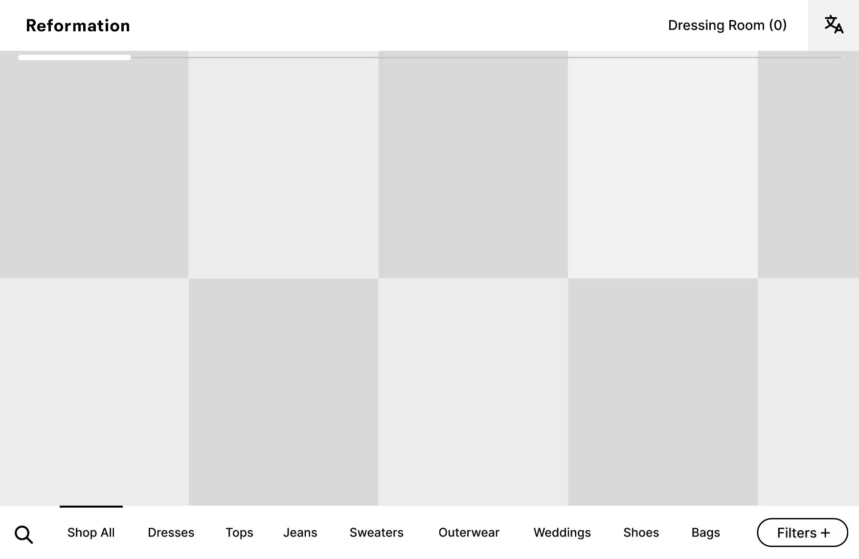
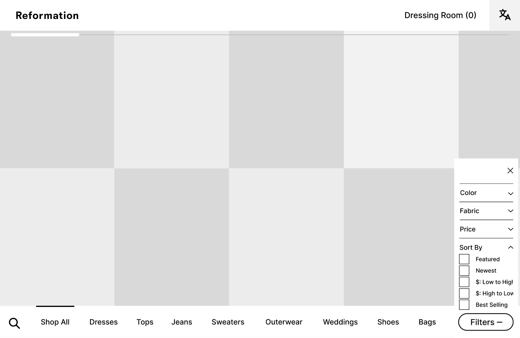
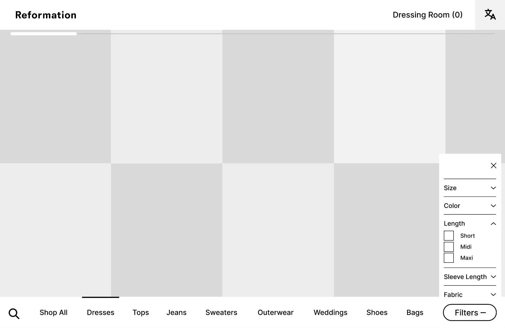
The screens’ function is confusing for new users. The prominent “Tap to Start” prompt encourages immediate action, while important instructions—small and placed low—are often missed, causing users to proceed without understanding the process.Limited Filtering Options:
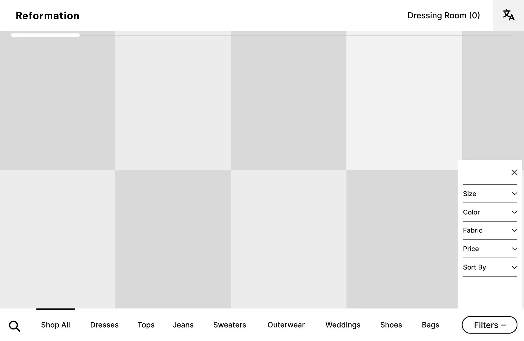
Filtering is too broad, lacking specifics like size, color, or material. This makes finding exact items, like a medium green bridesmaid dress with long sleeves, inefficient and frustrating given the store’s wide selection.Language Barrier:
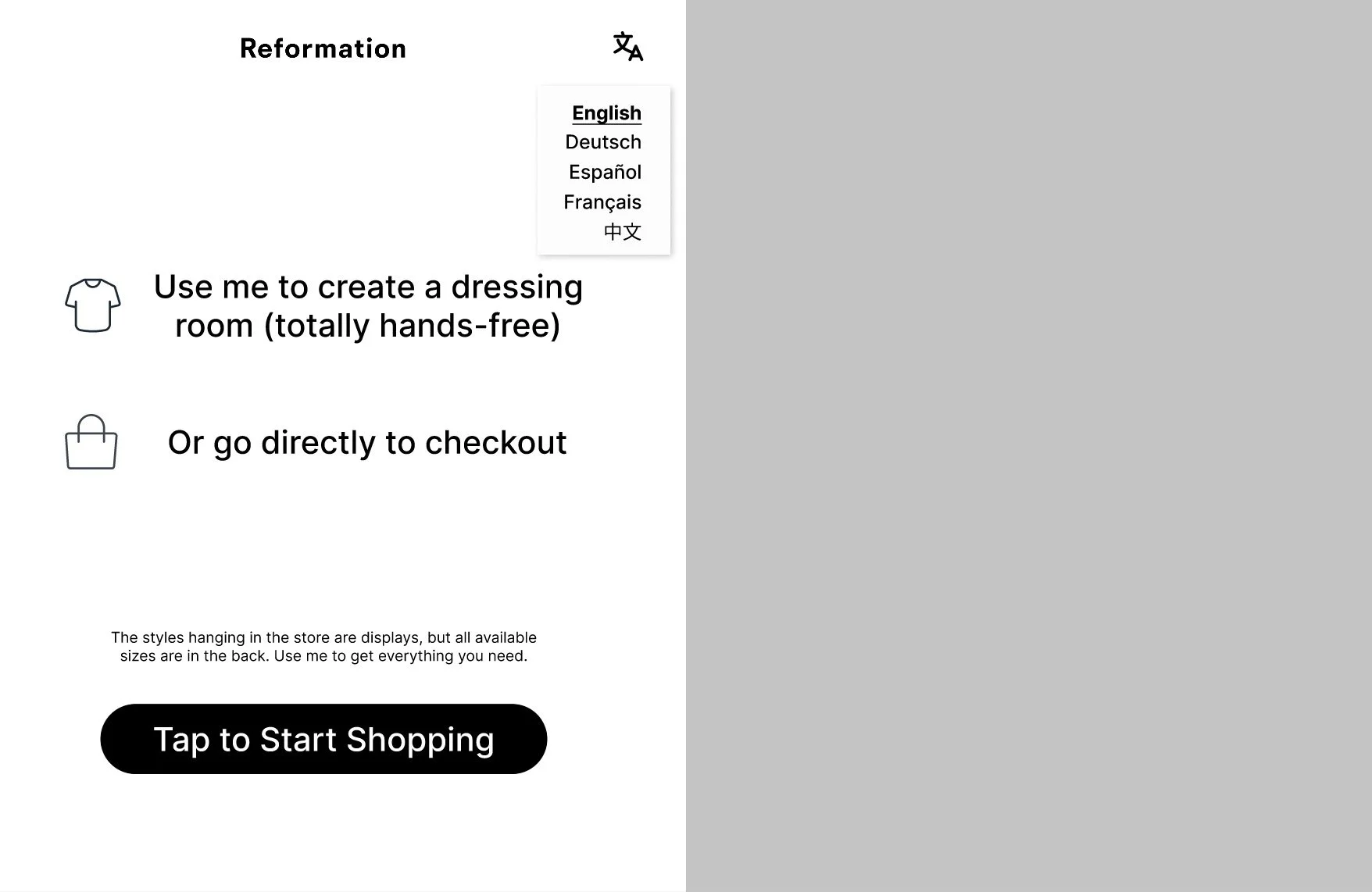
Screens are only in English, posing a challenge for many international shoppers and creating a confusing experience for non-English speakers.
User Research
Since this project was developed for my own personal interest, I did not conduct formal user research. However, I relied on my observations and experiences in the Reformation Soho store, as well as my understanding of common user behaviors and challenges in similar contexts. Although formal user testing was not part of this process, I aimed to create solutions that are grounded in practical, real-world scenarios and align with proven UX principles.
Low-Fidelity Prototype